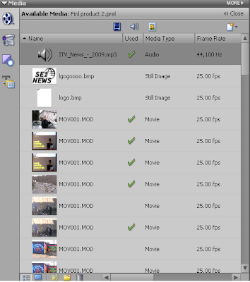
 Once we had got permission to use ITV's theme tune we downloaded the clip and added it to Premiere. We got the theme tune clip off of a website which I mentioned earlier in my blog. We opened up Premiere and placed song into the file list. We did this for all the media files that we wanted to add to the project. When all the files were ready to be placed into the time line they all appeared in the file list on left.
We then added the media we wanted into the time line this began the process of creating the actual video. 
The yellow line on each of the clips in the opacity line which we used to set the contrast on the image part of the clip and the loudness of the volume on the sound part of the clip. On all image parts of the clips we made sure the opacity line was right up to the top to give the best lighting quality. On the sound opacity line we kept the line up to the top during the speaking parts and for most of the title sequence. However at the beginning of the clip we set the sound opacity line down so you could still hear the music while Runi was talking but just faintly.
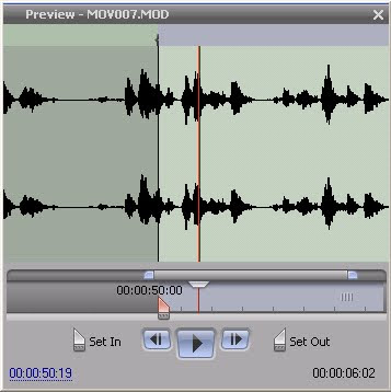
When we selected the sound and part of the clips that we wanted we used the set in and set out tools. These can be clearly shown in the screen shot. When the clip is set in that is the starting point and when it is set out that is where the clip ends.
We also added text to some of the clips which was easy to do using the text tool bar. We selected the add text tool then the toolbar appeared. The text could be formatted to how we wanted it; font, size, colour, position.
When the text was ready to be entered a white box appeared around the selected clip. We placed the text in the left hand corner displaying the conventions of a real media product. It introduces the character and also makes the clip look professional.
Website

In constructing the website this properties tool bar was the main tool bar which was used. The tool bar allowed me to:
-Edit fonts
-Edit colour schemes/produce colour schemes
-Create internal and external links
-Change background colours
-Change border sizes
-Change images and video sizes
-Change the alignment of the content in the cells.
-Edit fonts
-Edit colour schemes/produce colour schemes
-Create internal and external links
-Change background colours
-Change border sizes
-Change images and video sizes
-Change the alignment of the content in the cells.

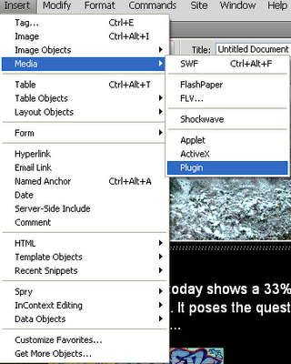
To enter images and videos I used the insert drop down menu on the Dreamweaver tool bar. Selecting image to insert various images and media, along to plug in to insert videos.
Once the plug in option is selected a new screen appears asking for the media to be selected. Then once it was placed in Dreamweaver I used the properties tool bar to edit the video.
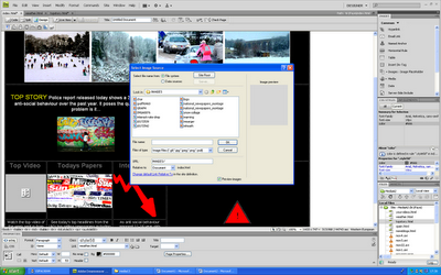

Once the image option is selected a new screen appears asking for the image to be selected. Then once it was placed in Dreamweaver I used the properties tool bar to edit the image.
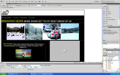
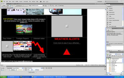
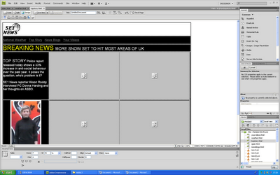
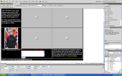
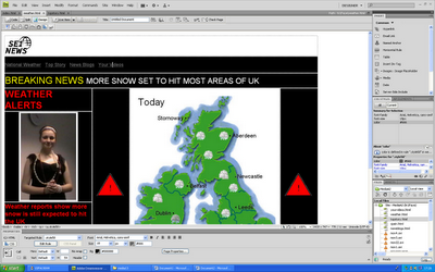
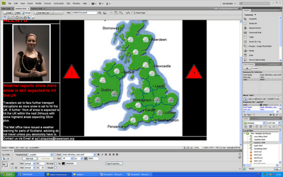


The print screens above show the completed pages produced in Dreamweaver.
CONCLUSION
CONCLUSION
I feel that overall the products produced were of good quality and developed forms and conventions of real media products. Out of the three tasks I like the news programme the most as it looks professional and develops conventions of media products. It looks professional and covers real life topics. However if I had the opportunity to make it again I would improve the lighting on some of the clips that were filmed in front of the interactive white board. Some of the shots are not as clear as I wanted them to be but we could not change the lighting anymore than we already had.
I really like the website and title sequence and feel that all three media products develop the conventions of real media products, cover real life issues and create a brand image. I would add more features to the website if I had the opportunity and take the graph clip out of the title sequence as I feel it does not look very professional watching it back. However in general I am pleased with the products that were produced.


No comments:
Post a Comment