Receiving feedback was an essential process in evaluating the effectiveness of our media products. During our break and in our media lessons we asked a number of pupils to look at our products and evaluate the effectiveness of each. For the evaluation of the title sequence and news programmes we asked the girls to watch the video and then write their thoughts down. I also asked some adults in my family to give me feedback on our video to get a range of opinions from different age groups and gender.
Here are some of the comments that were given:
Comment 1:
'The news report includes features which would be found in a real report. For example, going on site where the graffiti is, is something which i would expect to see. The framing is accurate so that you see enough of the area, but not too much so that the viewer does not lose focus.'
Criticism:
At one point the background music was covering the voice of the reporter. I found it a little difficult to understand what was being said.
Comment 2:
I really liked how all the clips were put together, it resembled a real news programme. I really like the weather bit and how it applied to real life news.
Criticism:
In one point the music is too loud and the reporter can not be heard correctly.
In one point the music is too loud and the reporter can not be heard correctly.
Comment 3:
It followed the conventions of a news report so looked professional and believable. Use of different ethnic people showed that there was multi-culture.
Criticism:
The timings were still a 'bit off' at points and the lighting could do with being changed in some parts of the video.
Graph showing the number of people who gave negative and positive feedback.
Graph showing the number of people who gave negative and positive feedback.
From the feedback given by the viewers, the majority of the comments were positive and the criticisms given were credible. I could see where they were all coming from in their constructive feedback. All respondents said that it resembled a real life news programme and the features/shots used aided this.
After receiving the criticisms I went back and looked at the final product again. I could clearly see where the music was too loud over the presenters voice. So we changed the theme tune volume on that part of the clip to make it clear what the presenter was saying. Again with the the criticism of the timings being off, we went back and listened to the clip again and made the necessary changes to the timings. There was a small gap between two of clips which we unfortunately had not noticed so we moved all the clips along to fix the timing issue.

With the lighting issue we tried to sort this issue as best we could. To fully sort the problem it would mean shooting a long series of clips again which would have been very time consuming so we moved the opacity level up on all the clips to give them maximum colour saturation.
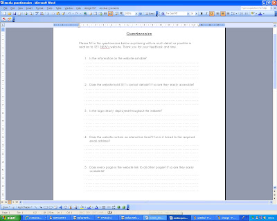
Here is a print screen of the questionnaire I produced asking for feedback on the website.

The questions on the questionnaire were:
1)Is the information on the website suitable?
2)Does the website hold SE1's contact details? If so are they easily accessible?
3)Is the logo clearly displayed throughout the website?
4)Does the website contain an interactive form? If so is it linked to the required email address?
5)Does every page in the website link to all other pages? If so are they easily accessible?
6)Has a range of multimedia features been used in the website? If so are they suitable?
7)Does the website contain any videos? If so do they relate to the purpose of the website?
8) What parts of the website do you like the most and why?
Some feedback
'I like all the videos and the interactive form as it engages the audience'
'The information is suitable and resembles a professional working website'
'The images are a bit blurred. In my opinion I feel it is a little over crowded'.
'Although the videos were useful, I feel that there was too many on the one page'.


No comments:
Post a Comment