Here is our final products which we produced; title sequence and news programme.
http://www.youtube.com/user/lmason01#p/a/u/0/cJIKeIYicTI
Wednesday, 31 March 2010
Evaluation 4
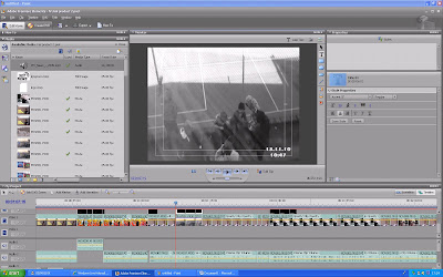
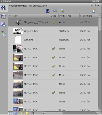 Once we had got permission to use ITV's theme tune we downloaded the clip and added it to Premiere. We got the theme tune clip off of a website which I mentioned earlier in my blog. We opened up Premiere and placed song into the file list. We did this for all the media files that we wanted to add to the project. When all the files were ready to be placed into the time line they all appeared in the file list on left.
We then added the media we wanted into the time line this began the process of creating the actual video. 
The yellow line on each of the clips in the opacity line which we used to set the contrast on the image part of the clip and the loudness of the volume on the sound part of the clip. On all image parts of the clips we made sure the opacity line was right up to the top to give the best lighting quality. On the sound opacity line we kept the line up to the top during the speaking parts and for most of the title sequence. However at the beginning of the clip we set the sound opacity line down so you could still hear the music while Runi was talking but just faintly.
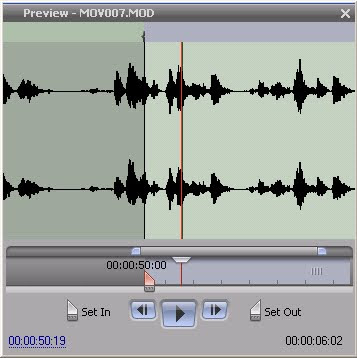
When we selected the sound and part of the clips that we wanted we used the set in and set out tools. These can be clearly shown in the screen shot. When the clip is set in that is the starting point and when it is set out that is where the clip ends.
We also added text to some of the clips which was easy to do using the text tool bar. We selected the add text tool then the toolbar appeared. The text could be formatted to how we wanted it; font, size, colour, position.
When the text was ready to be entered a white box appeared around the selected clip. We placed the text in the left hand corner displaying the conventions of a real media product. It introduces the character and also makes the clip look professional.
Website

In constructing the website this properties tool bar was the main tool bar which was used. The tool bar allowed me to:
-Edit fonts
-Edit colour schemes/produce colour schemes
-Create internal and external links
-Change background colours
-Change border sizes
-Change images and video sizes
-Change the alignment of the content in the cells.
-Edit fonts
-Edit colour schemes/produce colour schemes
-Create internal and external links
-Change background colours
-Change border sizes
-Change images and video sizes
-Change the alignment of the content in the cells.

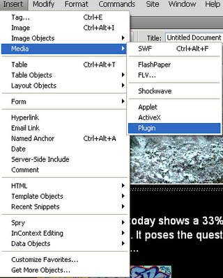
To enter images and videos I used the insert drop down menu on the Dreamweaver tool bar. Selecting image to insert various images and media, along to plug in to insert videos.
Once the plug in option is selected a new screen appears asking for the media to be selected. Then once it was placed in Dreamweaver I used the properties tool bar to edit the video.
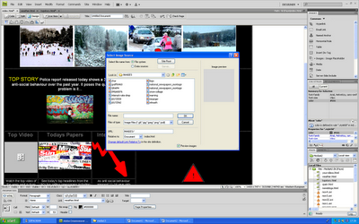

Once the image option is selected a new screen appears asking for the image to be selected. Then once it was placed in Dreamweaver I used the properties tool bar to edit the image.
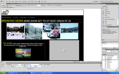
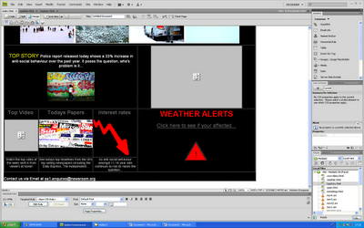
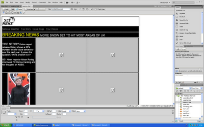
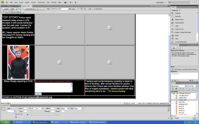
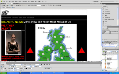
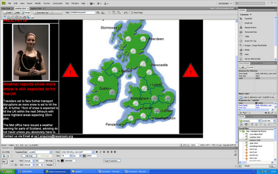


The print screens above show the completed pages produced in Dreamweaver.
CONCLUSION
CONCLUSION
I feel that overall the products produced were of good quality and developed forms and conventions of real media products. Out of the three tasks I like the news programme the most as it looks professional and develops conventions of media products. It looks professional and covers real life topics. However if I had the opportunity to make it again I would improve the lighting on some of the clips that were filmed in front of the interactive white board. Some of the shots are not as clear as I wanted them to be but we could not change the lighting anymore than we already had.
I really like the website and title sequence and feel that all three media products develop the conventions of real media products, cover real life issues and create a brand image. I would add more features to the website if I had the opportunity and take the graph clip out of the title sequence as I feel it does not look very professional watching it back. However in general I am pleased with the products that were produced.
Evaluation 1
In what ways does your media product use, develop and challenge forms and conventions of real media products?
During this task we have aimed to develop a project which resembles a real media product. Throughout the project I feel that we have developed not challenged forms and conventions of real life media products. The final product we produced holds the same features and content of that of a real news programme. We chose to develop the conventions of real life media products instead of challenge them as we did not have much of an idea in how we could challenge the forms and conventions of news programmes. Although if we had set our sights from the start that we were going to challenge the forms then maybe we could have come up with an interesting idea. However we decided to stick to what we knew as we felt that the end product would be a more realistic media product.
During this task we have aimed to develop a project which resembles a real media product. Throughout the project I feel that we have developed not challenged forms and conventions of real life media products. The final product we produced holds the same features and content of that of a real news programme. We chose to develop the conventions of real life media products instead of challenge them as we did not have much of an idea in how we could challenge the forms and conventions of news programmes. Although if we had set our sights from the start that we were going to challenge the forms then maybe we could have come up with an interesting idea. However we decided to stick to what we knew as we felt that the end product would be a more realistic media product.

Camera work – We had to create professional shots as the main content of our news programme was based on a report on ASBO which included several interviews. These interviews were of a formal nature so we needed the camera to be fixed on the tripod and kept in the same position throughout. After looking at different news programmes in my research it provided us with a format that we should use in the interviews. When interviewing PC Donna Harding and James Heath we positioned the camera so that they were in the far right corner of the shot. We did this so it appeared that they were talking to the interviewer who was ‘sat’ on the left next to the camera having a discussion.
In this shot we did not have any music or other sound being played, just PC Donna Harding’s voice in her interview and James Heaths voice in his interview. The lighting in the room was natural as it was filmed during the day so the rooms which the interviews were filmed in were bright. When positioning the camera we made sure that any natural light coming in from the windows did not affect the shot quality as light shone in and hit the camera lens. Mise-en scene wise we did not need any extra props in these shots. We wanted a natural interview with them both in their place of work. So in PC Donna Harding’s shots it was just her sat on a chair in an interview room in Belvadere Police Station. With James it was just him again sat on a chair in his office.
From the clips we took of PC Donna Harding and James Heath not much editing was required. All that we needed to do was cut the clips using the set in and set out tools to the part of the clip we wanted to use. When we edited the footage we cut out quite a lot of the interviews as both of them kept saying ‘erm’ which we felt did not look professional. Although we wanted the interviews to look natural, the consistency in which they kept saying ‘erm’ looked too natural. Also when we put all out video together we decided that we would use some cut a ways during the interviews which related to what they were talking about. We did this to split up the interview and kept the viewer interested in the content. We did this by selecting the clip we wanted to place the cut away on and unlinked the sound and the visual clip. We cut down the visual clip to the length we wanted using the set in and set out tools and placed the cut away clip in. We left the sound as it was on the sound line in Premier so that when the cut away was shown the interviewees voice played over the clip.

Camera work – All of our shots taken for the project had to be professional to add to the nature of the product. The topics discussed were of a serious and professional nature so the clips to go with it also needed to be professional. When filming Runi at the start we had her placed in front of an SE1 backdrop used in real programmes. When the presenter is talking there is some sort of backdrop whether it includes the logo or the programmes colour scheme every news programme has one. The camera was placed on the trip pod and left in the same position throughout as no zooming was needed.
In this shot we did not have any music or other sound being played, just Runi’s voice (however at the very beginning of the clip we edited in the end part of the theme tune, cutting from the title sequence). After looking at the conventions of real news programmes it became apparent that they all use progressive verbs to continue a description but keep a level of here and now journalism. ‘More heavy snow set to hit the UK within the next 24 hours’. The lighting in the room was quite hard to get right as we were filming the interactive white board. We needed to be able to see Runi but did not want the light reflecting off of the board. We controlled the light in the room using the various switches which controlled different sets of lights in the room. We turned off all the immediate ones which reflected off the board and so that the only ones on highlighted Runi.natural as it was filmed during the day so the rooms which the interviews were filmed in were bright. Mise-en scene wise we needed a desk, some papers, the backdrop and an interactive white board. These were easy to come by and were similar props to those used in News studios.
From the clip we took of Runi not much editing was required. All that we needed to do was cut the clip using the set in and set out tools to the part of the clip we wanted to use. When we edited the footage we only cut out the bits where she ‘messed up’ or there was a too long pause. The only other part we edited was the theme tune so that the end music from the title sequence overlapped slightly onto the beginning of Runi’s clip introducing the report. This was easily done by moving the sound clip along on the sound bar in Premier. We then faded the sound into Runi’s clip so you could slightly hear the theme tune in the background, used in real news programmes. Using the opacity bar on the clip we pulled it down were we wanted it to fade to quiet.
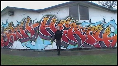
Camera work – When filming Alison we needed the shots to look professional as she was doing a report on ASBO. In this clip she is filmed ending her report. The camera was placed on the tripod to get a professional, still shot. To get her emotion from the story we zoomed in on her as she used formulaic constructions. ‘Alison Roddy. Reporting from Erith. Back to the studio.’ This convention is widely used in news programmes all over the world. To produce a real life media product we added this in to give a professional look.
In this shot we did not have any music or other sound being played, just Alison’s voice. As Alison was filmed outside by the graffiti in natural light, we did not need to control the lighting. We just made sure that there was no light reflecting onto the camera lens. Mise-en scene wise all we needed was the graffiti wall to aid what Alison was talking about.
From the clip we took of Alison not much editing was required. All that we needed to do was cut the clip using the set in and set out tools to the part of the clip we wanted to use. When we edited the footage we only cut out the bits where she ‘messed up’ or there was a too long pause. This was all the editing done on this particular clip.
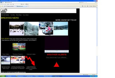
In this shot we did not have any music or other sound being played, just Runi’s voice (however at the very beginning of the clip we edited in the end part of the theme tune, cutting from the title sequence). After looking at the conventions of real news programmes it became apparent that they all use progressive verbs to continue a description but keep a level of here and now journalism. ‘More heavy snow set to hit the UK within the next 24 hours’. The lighting in the room was quite hard to get right as we were filming the interactive white board. We needed to be able to see Runi but did not want the light reflecting off of the board. We controlled the light in the room using the various switches which controlled different sets of lights in the room. We turned off all the immediate ones which reflected off the board and so that the only ones on highlighted Runi.natural as it was filmed during the day so the rooms which the interviews were filmed in were bright. Mise-en scene wise we needed a desk, some papers, the backdrop and an interactive white board. These were easy to come by and were similar props to those used in News studios.
From the clip we took of Runi not much editing was required. All that we needed to do was cut the clip using the set in and set out tools to the part of the clip we wanted to use. When we edited the footage we only cut out the bits where she ‘messed up’ or there was a too long pause. The only other part we edited was the theme tune so that the end music from the title sequence overlapped slightly onto the beginning of Runi’s clip introducing the report. This was easily done by moving the sound clip along on the sound bar in Premier. We then faded the sound into Runi’s clip so you could slightly hear the theme tune in the background, used in real news programmes. Using the opacity bar on the clip we pulled it down were we wanted it to fade to quiet.

Camera work – When filming Alison we needed the shots to look professional as she was doing a report on ASBO. In this clip she is filmed ending her report. The camera was placed on the tripod to get a professional, still shot. To get her emotion from the story we zoomed in on her as she used formulaic constructions. ‘Alison Roddy. Reporting from Erith. Back to the studio.’ This convention is widely used in news programmes all over the world. To produce a real life media product we added this in to give a professional look.
In this shot we did not have any music or other sound being played, just Alison’s voice. As Alison was filmed outside by the graffiti in natural light, we did not need to control the lighting. We just made sure that there was no light reflecting onto the camera lens. Mise-en scene wise all we needed was the graffiti wall to aid what Alison was talking about.
From the clip we took of Alison not much editing was required. All that we needed to do was cut the clip using the set in and set out tools to the part of the clip we wanted to use. When we edited the footage we only cut out the bits where she ‘messed up’ or there was a too long pause. This was all the editing done on this particular clip.

When creating the website we wanted to develop the conventions and forms of real media products. I produced the website so that it resembled that of the ones I analysed in my research. All of the websites looked at focused on some form of a top story which I displayed in our website. I placed the top story on the main menu and also on a separate page. The conventions of real media products which I looked at were taken into consideration and used in my final product. All the websites used images and videos to make the site look interesting and also to give imagery information as well as written. Also on the top story page I have allowed the users to add any comments which are also widely used in real life products.

I also made a weather page which again is used in real media product websites. It displayed today's and tomorrows weather via a rollover image feature which is also commonly used. I used a simple layout and applied the colour scheme used throughout the other tasks on the website, creating that brand image. I also placed SE1 NEWS logo and created a master style at the top of the page which has also been used in the websites I analysed. The links are easy to find and placed at the top of the page underneath the master style. The final main feature which I used on my website which is used in real media products is the marquee feature ‘Breaking News….’ as it scrolls across the page catching the users attention. This is a common feature used in commercial websites to make the site eye catching and appealing to the user. It also allows them to see regular updates easily. Real life images have been used showing real life on 'today's news'.
Evaluation 3
What have you learned from your audience feedback?
Comment 3:
It followed the conventions of a news report so looked professional and believable. Use of different ethnic people showed that there was multi-culture.

Receiving feedback was an essential process in evaluating the effectiveness of our media products. During our break and in our media lessons we asked a number of pupils to look at our products and evaluate the effectiveness of each. For the evaluation of the title sequence and news programmes we asked the girls to watch the video and then write their thoughts down. I also asked some adults in my family to give me feedback on our video to get a range of opinions from different age groups and gender.
Here are some of the comments that were given:
Comment 1:
'The news report includes features which would be found in a real report. For example, going on site where the graffiti is, is something which i would expect to see. The framing is accurate so that you see enough of the area, but not too much so that the viewer does not lose focus.'
Criticism:
At one point the background music was covering the voice of the reporter. I found it a little difficult to understand what was being said.
Comment 2:
I really liked how all the clips were put together, it resembled a real news programme. I really like the weather bit and how it applied to real life news.
Criticism:
In one point the music is too loud and the reporter can not be heard correctly.
In one point the music is too loud and the reporter can not be heard correctly.
Comment 3:
It followed the conventions of a news report so looked professional and believable. Use of different ethnic people showed that there was multi-culture.
Criticism:
The timings were still a 'bit off' at points and the lighting could do with being changed in some parts of the video.
Graph showing the number of people who gave negative and positive feedback.
Graph showing the number of people who gave negative and positive feedback.
From the feedback given by the viewers, the majority of the comments were positive and the criticisms given were credible. I could see where they were all coming from in their constructive feedback. All respondents said that it resembled a real life news programme and the features/shots used aided this.
After receiving the criticisms I went back and looked at the final product again. I could clearly see where the music was too loud over the presenters voice. So we changed the theme tune volume on that part of the clip to make it clear what the presenter was saying. Again with the the criticism of the timings being off, we went back and listened to the clip again and made the necessary changes to the timings. There was a small gap between two of clips which we unfortunately had not noticed so we moved all the clips along to fix the timing issue.

With the lighting issue we tried to sort this issue as best we could. To fully sort the problem it would mean shooting a long series of clips again which would have been very time consuming so we moved the opacity level up on all the clips to give them maximum colour saturation.
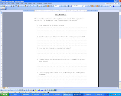
Here is a print screen of the questionnaire I produced asking for feedback on the website.

The questions on the questionnaire were:
1)Is the information on the website suitable?
2)Does the website hold SE1's contact details? If so are they easily accessible?
3)Is the logo clearly displayed throughout the website?
4)Does the website contain an interactive form? If so is it linked to the required email address?
5)Does every page in the website link to all other pages? If so are they easily accessible?
6)Has a range of multimedia features been used in the website? If so are they suitable?
7)Does the website contain any videos? If so do they relate to the purpose of the website?
8) What parts of the website do you like the most and why?
Some feedback
'I like all the videos and the interactive form as it engages the audience'
'The information is suitable and resembles a professional working website'
'The images are a bit blurred. In my opinion I feel it is a little over crowded'.
'Although the videos were useful, I feel that there was too many on the one page'.
Saturday, 27 March 2010
Evaluation 2
How effective is the combination of your main products and ancillary texts?
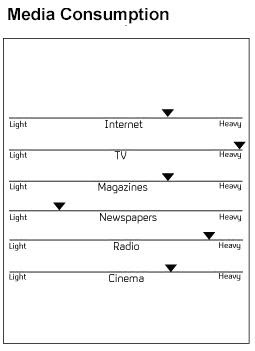
For the brief I chose to do, we had to produce a news programme, a title sequence for the news programme and finally a website for the news programme. When doing my research on different news programmes they all had some form of a title sequence and a linked website to the programme. The ways in which media is consumed is constantly changing, from the dependence of getting the latest news from newspapers to getting the latest stories via the Internet. We wanted to produce products which kept up with the changing trends.
The news programme
After doing our research we had a clear idea of what we wanted our news programme to be about. With the media focusing on the downfall of youth behaviour we thought that this would be an interesting topic. As not all of the younger generation are involved in anti-social behaviour we wanted to high light this in our product. Also with the changing trends we wanted to produce a product which related to real life situations which is a ‘real’ news programmes purpose. Also producing a weather report which highlighted the bad weather that hit the UK in December/January also applied to real life situations included in real media products.
With producing the news programme it was not just simply selecting a song and producing a video to go with it, a lot of research needed to be done to produce the correct narrative for the product. As I watch the news regularly to keep up with the latest stories, I had a good idea of the narrative that was used. The narrative used in the researched news programmes is carefully selected to add suspense on the top stories which are going to be discussed. One clip I looked at during my research showed how the narrative is carefully selected to draw the viewer in; ‘the ultimate sacrifice’. Those two words add drama and suspense to the topic which is going to be discussed straight away. The words are harsh and bold in the sentence drawing the viewer in. We wanted our product to be as ‘real’ as possible targeting the news audience. As people get older they become more interested and concerned with what is happening in the media. When I was younger I did not watch the news as I was to naive to realise the serious topics discussed in the news, however now that seriousness is effectively portrayed in the media.
After doing my research it provided me with a clear idea of the colour, fonts, texts, images and sound that should be used to create a real media product. When selecting the theme tune for our news programme we both decided that we would use ITV’s music. The beat in the music creates a serious tone for the topics which are going to be discussed. The loud trumpet noises set a harsh tone and draw the viewer in again adding to the seriousness of the topics. As the main topic that was going to be discussed in our product was a serious issue that more of society need to address we wanted music to address this.
Also during our research sad stories such as Rhys Jones of whom was shot by a group of teenagers who were caught up in gang culture. We thought doing a story on anti-social behaviour would allow us to look at what could be done to prevent or high light why this was happening and in fact who was to blame. Looking at what could be done may even provide the real world with suggestions on what could actually be done for trouble youths. I feel that the topics we chose to include in our product could potentially have an effect on real life and maybe provide answers to the real world.
Title Sequence
With the news programme we produced a title sequence, again with the changing trends we wanted to produce a sequence that was ‘up to date’. When doing my research I looked out how ITV did a complete revamp of their title sequence. They went from the old focus on Big Ben to a high tech title sequence involving a range of media. I really liked how ITV had taken a risk and completely changed their title sequence and we decided that we wanted to produce a product with similar qualities. We wanted to combine the old title sequence features with the new revamped sequence. So we decided that we would start with a focus on our version of Big Ben and then combine the new sequence features which would involve a range of different shots related to the topics mentioned in the news programme. To make sure there was a clear link between our three products we made sure that the clips in the title sequence related to the news programme. We used the CCTV footage clip again during the actual news programme and placed a shot our main focus; the clock, at the end of the sequence. This allowed the viewer to have a clear link with the two products.
Website
For the website I looked at different news websites to get an idea of what we should include, content wise. A clear feature was that the main topics mentioned in the actual news programme were then linked on the website also as main stories, being displayed on the main page. Again as we wanted to produce real life products we took these ideas on board and produced a website with real life qualities. To make sure that there was a clear link between all three products we used SE1 NEWS’ logo on all three. This provided a brand image for the three products produced. We decided that we would have our top story mentioned in the news programme as the main feature on the website, placing it on the main page. The font used throughout the researched websites was simple and easy to read allowing the imagery to do ‘the talking’. However although a wide range of imagery was used in each of the websites the stories covered were very informative appealing to the target audience. The images I used in the website related to the chosen topics discussed and also had a link with the other two tasks. For example in the title sequence there is a shot of newspapers being dropped onto a table representing the story ‘today’s papers’, on the website I placed this story title and an image of different newspapers displaying a clear link. Also to create this ‘brand image’ we used a set colour scheme throughout allowing the viewer to relate to all three products. The yellow, black, white and elements of red that we used were features in all three of the products aiding us to creating a brand image.
Due to this brand image that I feel we created through our three products, they work very well together. The viewer can easily relate between the three products and real life issues are covered in each. However there is always room for improvements, if I had an opportunity to produce the products again I would change several things to improve the project overall. The main feature that I would change would be the website as there are an endless number of features which can be added, but there simply was not the time. Although I feel that the website looks professional, the features used are quite simple, more hot spots could have been used providing the audience with extra information and also maybe adding more text to the stories. Also in the title sequence I feel that if I could make it again I would cut out the graph shot as I feel it is not as of good quality as the other shots in the sequence. Although it represents the interest rates story I feel a better shot could be taken to present this story in a better light.
Overall I really like how we managed to keep good links between the three tasks. The logo, colour scheme and font styles were used in each and created a successful brand image. I also really like the cut a way’s during the interviews as they make the clips look more interesting and provide visual information for what is being discussed. I am generally very pleased with the final news programme which we produced.
Thursday, 25 March 2010
Print screens of website
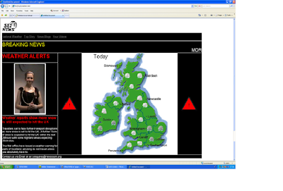
Weather page.
Top story page.
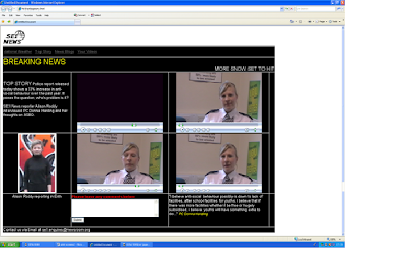
Home page.
Here is our final website. The bottom screen shot is of the main menu which links to the weather and the top story page. All the pages link with each, images, videos, texts, rollover images, master style and company logo have all been used. I am very pleased with the final product I feel it is of good professional quality and successfully adds to the brand image.
Friday, 19 March 2010
Wednesday, 17 March 2010
Slides for filming
Weather Map Own Version1
View more presentations from fallen12.
Here is the slide I produced to be used as the back drop for the news presenter scenes, then onto the weather report and then onto the end credits.
Wednesday, 10 March 2010
NEED FOR CHANGE!
After putting all our footage together we found that the interviews were too long so we needed to think of something to break them down. So we decided that we needed to do some extra filming to produce some cut outs during the interview. As PC Harding and James Heath talk about the lack of family time we decided that we would film family activities such as playing on the wii. They both give some suggestions for what could be done so we then decided that we would produce another cut out of 'paid' activities which these troubled youths could attend.Lauren said that she would film her Dad's steel drum class. Another idea we had was filming a child holding an adults hand showing the need for family time.
Subscribe to:
Comments (Atom)


