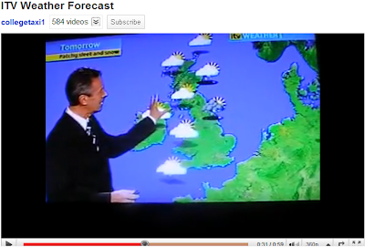
Here is the clip I looked at.
The weather reporter introduces himself first and then gets straight to the point drawing the user in with the image behind him. When he is talking about the weather forecast he turns and points at the image which I think is effective as he draws in the audience by pointing out particular regions on the map. He also starts off by mentioning today's weather then going to over night and then into tomorrow morning with the images on the map showing the change in time. There is also a Met Office weather warning displayed at the bottom of the page showing the real effect of that 'cold weather'. The day and the companies logo is also shown which I feel looks very professional which we need our report to be like. Finally at the end of the sequence he faces back to the camera showing the report is finished and a new clip appears showing the sponsors. Looking at this clip has given me a good idea of what to include in our report. I like all the features that have been used here as they are very effective in drawing the user in and obtains that professional image. I will now adapt these features to my design.


