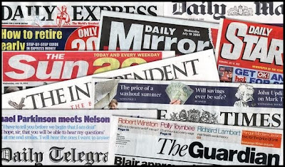
The image of the newspapers will introduce the story 'Today's Papers'. I changed the contrast on the image making the colours brighter. This made the image more eye catching and interesting to look as the blues and reds of the headers really stand out.
Like the previous images I changed the contrast making the arrow brighter. The picture stands out more and is eye catching as the bright red arrow appears to be coming out of the background. The image will introduce a story about the current interest rates in the economic climate.
As we decided that the Breaking News story would be on the extreme weather that the UK was facing, there needed to be images of the conditions. I decided to make a collage with all the photos above to place them under the footer on our website.

Here is the collage I made out of the photos above. I made the images smaller and cut out the unwanted sections in each of the photos. Then I softened the images and changed the contrast so that they appeared brighter. This made the images look more appealing and eye catching as the snow was whiter and brighter.

Here is the collage I made out of the photos above. I made the images smaller and cut out the unwanted sections in each of the photos. Then I softened the images and changed the contrast so that they appeared brighter. This made the images look more appealing and eye catching as the snow was whiter and brighter.
I edited the photos using an online photo editer; Picnik.


No comments:
Post a Comment